
Week 9 - Creating the battle UI
- Olivia
- Apr 29, 2020
- 2 min read
Updated: May 29, 2020
I started this week by designing the user interface elements needed for the post battle screens, including loot, pickups, text options and replay screens for examples. These designs from my sketchbook are below.


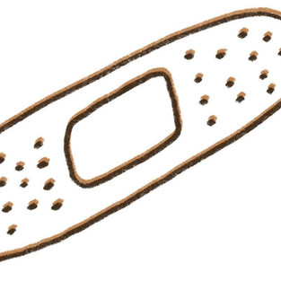
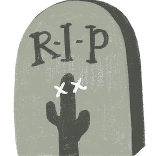
Next I spent a few days digitalising the designs I had for the battle UI. I worked mostly from a list that a couple of other team members had put together as well as adding in some extras. These are all shown in the gallery below, including cursors, skill icons, character frames, selection images, buttons etc. They are all block colour apart from the grave icons, the status effect icons, the skill icons and the menu icon. For these I employed the use of one much lighter shade and one much darker shade to block out highlights and shadows (no blending, no gradiation, simple 3-tone palettes. The methods I use are expanded on in the UI section).


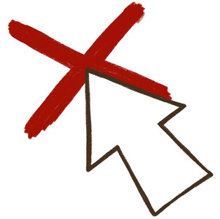


This week myself and the coder tried to implement some in-battle animations. We tried it purely with a selection arrow at first but there was a lot of back-and-forth trial-and-error and we decided to put it to one side. It isnt crucial to the gameplay and we spent a while trying to make various file formats look appropriate but it just isn't something we can develop at the moment. Based on this we are scrapping any UI highlighting which character is selected at any one time, which characters you are attacking, potential 2D death animations etc. As they aren't key to the gameplay working I'm not too worried and there is quite a lot of UI on-screen during the battles anyway so I'm happy to be focussing on other areas and put this idea in the 'lack-of-time' box.


Comments